Data story
We stacked 2,778 best-selling sneakers to find the average one
Take the side view of every sneaker that sold well on GOAT and StockX in the past year, scale each to the same length and average them. The result is a low-to-mid cut with a white sole, and a coin flip between a black and a white upper. Then see which real pair comes closest, and how close yours is.
Source: GOAT and StockX best sellers, October 6, 2025 to October 6, 2026. Outlines traced from product photos (GOAT, StockX).
The average sneaker is a low-to-mid cut, about half as tall as it is long
Scale every outline to the same heel-to-toe length, line them up and average them: the bold line is the result. At its highest point it stands 0.49 of its length, so for every 10 inches long it is 4.9 inches tall. The heel collar reaches 0.41 and the toe box 0.23.
Heights are fractions of heel-to-toe length. The average is weighted by each design's sales (6,527,950 in total, October 6, 2025 to October 6, 2026). Faint lines: 600 of the 2,778 outlines.
Counting sales instead of designs barely changes the shape
A sneaker that sold far more pairs should count for more than one that barely sold, so the bold line is weighted by sales. The dashed gray line gives every design one vote instead, and it sits almost on top of the bold one.
The gap between the two is 0.019, less than a quarter of the typical gap between one sneaker and the average (0.080). Sales are concentrated, so weighting counts the 2,778 designs as roughly 273 equally popular ones. The answer holds either way.
“Gap” here means the leftover difference between two outlines after scaling, rotating and sliding one to fit the other as closely as possible (Procrustes distance; 0 is identical).
A white sole is the only color that clearly wins
We took each sneaker's most common color in four zones, then counted by sales. 51% of sales went to sneakers with a white sole, against 33% for black. Above the sole it is close to a coin flip: the upper is black 41% versus white 40%, the toe white 42% versus black 39%, the heel black 40% versus white 37%.
Share of sales by each shoe's most common color in the zone, top three per zone. The drawing fills each zone with its top color; zones are simple cuts (toe, heel, a band along the sole), not real panels, and laces and seams are not drawn.
Averaging the photos themselves gives a gray ghost of a sneaker
Black and white cancel out, so the middle color at each pixel across the best sellers' photos comes out gray. You can still make out a window of visible air under the heel, the signature of Air Max and Jordan, and faint side stripes like an ASICS.
We warped the photos of the 600 best sellers onto the average outline and took the sales-weighted median color at every pixel.
The closest real sneaker is a Kobe 6 ASG Hollywood 3D, but 35 are effectively tied
We measured how far each of the 2,778 outlines is from the average. The closest is the Nike Kobe 6 Protro ASG Hollywood 3D (2026), a gap of 0.033. Next come the Nike Air DT Max 96 Low 'Black Metallic' and the Nike Air Max 1 CLOT Kiss of Death (2021).
Do not read too much into first place. The same shoe photographed by GOAT and by StockX differs by a median 0.045 just from camera angle and lacing, and 35 sneakers are within that distance of the average, so they are a statistical tie. Among the 40 closest, Air Max appears 7 times, Air Jordan 3 5 times, Air Force 1 4 times and Yeezy 700 4 times.
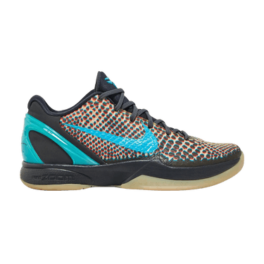
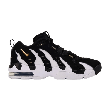
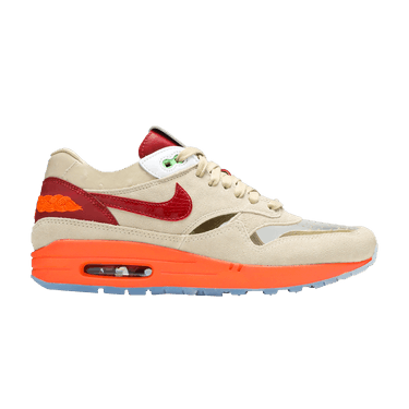

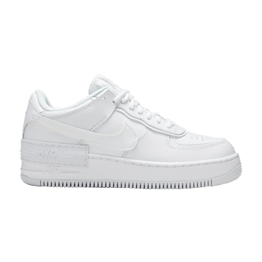

Gap from the average in bold. The kids' version of the Kobe 6 is the next-closest listing and is left out as a twin.
4 of the 8 most unusual best sellers are Jordan 5s
Among the 300 best sellers, the biggest outliers are the Salomon XT-6 Gore-Tex Black Silver (0.195) and the adidas Samba Jane White Black Gum (Women's) (0.183). 4 of the 8 most unusual are Jordan 5s, which have a tall tongue that stands up above the collar; the Jordan 5 Retro Wolf Grey (2026) alone had 97,922 resale sales.
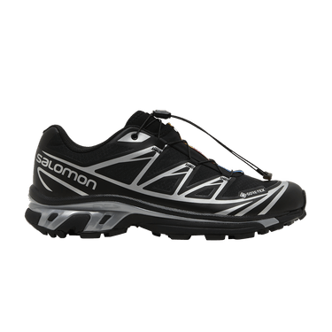
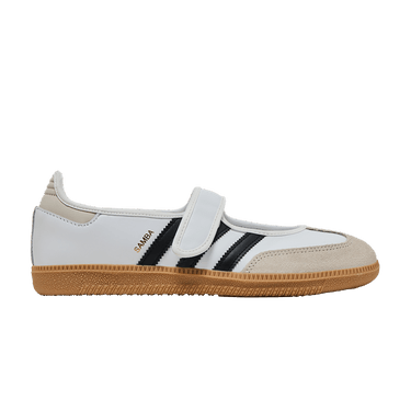
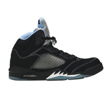

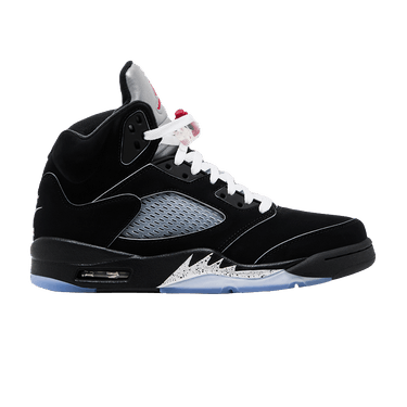
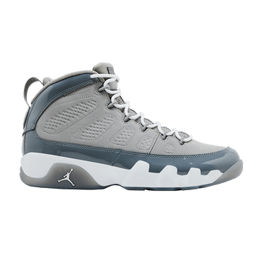
Top 300 best sellers by sales; gap from the sales-weighted average in bold. The median gap for all 2,778 designs is 0.080.
High-top versus low-top is half of all the variety
How high the shoe rises explains 51% of the differences between outlines, more than everything else together.
Drag the slider to push the average shoe toward either end. At the left end (high-top / mid) its highest point stands 0.60 of its length; at the right end (low-cut), 0.38.
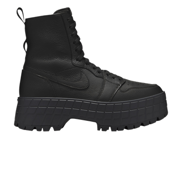
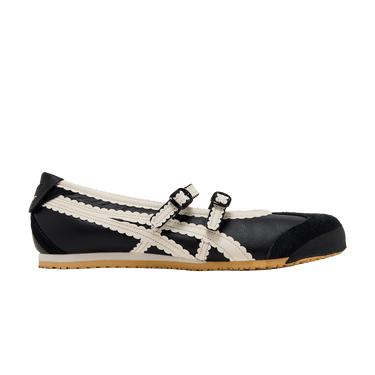
Left to right in the photos: the two shoes farthest toward the left end, then the two farthest toward the right. We found the four directions in which outlines vary most (principal components of the aligned outlines, unweighted); the ends are two standard deviations either side of the average. Together the four explain 78%.


Next: sleek runners versus bulky heels and toes
The second way outlines differ, at 13% of the variety, is how bulky the shoe is at the heel and toe.
Drag the slider to push the average shoe toward either end. At the left end (bulky heel, tall toe box) the heel collar reaches 0.44 of its length; at the right end (sleek, low toe), 0.37.
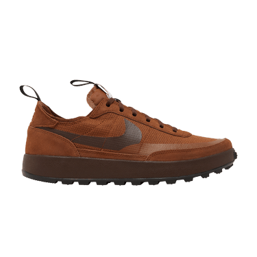
Left to right in the photos: the two shoes farthest toward the left end, then the two farthest toward the right. We found the four directions in which outlines vary most (principal components of the aligned outlines, unweighted); the ends are two standard deviations either side of the average. Together the four explain 78%.


Then: a tongue that sticks up versus a flat topline
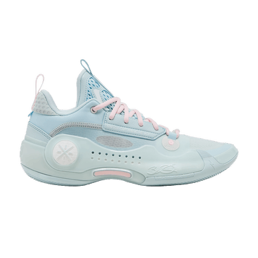
The third way, 9% of the variety, is the shape of the topline: how far the tongue stands up.
Drag the slider to push the average shoe toward either end. At the left end (flat, slipper-like topline) the topline peaks at 0.43 of its length; at the right end (tall tongue, dipped collar), 0.51.
Left to right in the photos: the two shoes farthest toward the left end, then the two farthest toward the right. We found the four directions in which outlines vary most (principal components of the aligned outlines, unweighted); the ends are two standard deviations either side of the average. Together the four explain 78%.

Last: a thin flat toe versus a rounded, raised one
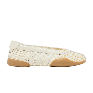
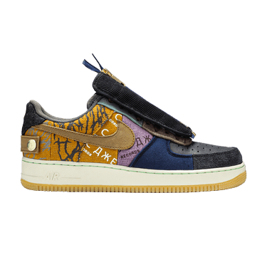
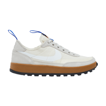
The fourth way, 6% of the variety, is the toe: flat and thin, or rounded and lifted.
Drag the slider to push the average shoe toward either end. At the left end (rounded toe, raked heel) the toe tips up 0.08 of its length off the ground; at the right end (thin flat toe, upright heel), 0.04.
Left to right in the photos: the two shoes farthest toward the left end, then the two farthest toward the right. We found the four directions in which outlines vary most (principal components of the aligned outlines, unweighted); the ends are two standard deviations either side of the average. Together the four explain 78%.
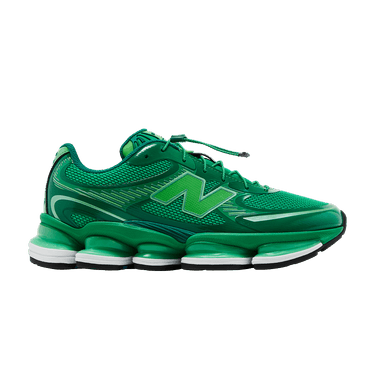

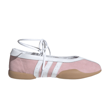
Jordan is the tall one; adidas sits lowest
We repeated the exercise for the five biggest brands. Jordan's average is 0.544 as tall as it is long, well above the overall 0.49; the lowest is adidas, at 0.425. Nike is the closest to the overall shape (gap 0.030).
Both follow from the mix: Nike is 44% of the designs, so the overall average looks like a Nike, and Jordan is 43% of sales, so it pulls the average upward.
Sales-weighted average outline per brand, drawn over the all-brand average (dashed). Jordan is Jordan Brand; adidas includes Yeezy; ASICS includes Onitsuka Tiger.
Best sellers are not getting taller
If sneakers have been getting chunkier, the outline does not show it. Across 2,597 designs with a release year (2015 to 2026), the height-to-length ratio of what people buy has moved +0.038 per decade, with a 95% range from −0.031 to +0.099. That range includes zero, so: no clear trend.
Count every design once instead of by sales and newer releases sit a little lower (−0.074 per decade, range −0.116 to −0.038). We do not read that as a trend: an older release that still sells in 2026 is usually a high-top classic, so the old end of the chart is full of tall survivors.
One thing this cannot show is how thick the sole is. Our outlines do not separate sole from upper, so chunky soles are not measured.
Year of release from StockX; retros carry their re-release year. Ranges come from resampling 282 model families, because many colorways of one silhouette are not independent shoes. Years with 10 or more designs are plotted. The sales-weighted line rises in 2026 because the 2026 releases that sold most are taller than the typical 2026 release (weighted 0.562, one vote per design 0.497).
In three numbers
How average is your sneaker?
Search the 2,778 best sellers to see where a pair sits against the average. It draws the shoe's outline over the average one and tells you how many best sellers are closer to the average than it is.
What this shows, and what it does not
The average sneaker of the past year is a low-to-mid cut with a white sole, and most of the 2,778 best sellers sit within a modest distance of it (the middle shoe is 0.080 away, nine in ten are within 0.130). No real pair matches it exactly, and about 35 are close enough that photo angle alone could reorder them.
It describes what sold, not what is good, and it says nothing about price or about which shoes will sell next. It is a side view only: width, the inner side, and sole thickness are not in the data.
Know the shape, now check the price. See what any of these pairs actually sold for on GOAT and StockX.
Open the price checkerQuestions
What does the average sneaker look like?
Averaging the side outlines of 2,778 best-selling sneakers on GOAT and StockX gives a low-to-mid cut that stands 0.49 as tall as it is long, with a heel collar at 0.41 and a toe box at 0.23. By sales, 51% had a white sole; the upper is a near tie between black (41%) and white (40%).
What is the most average sneaker?
The closest real sneaker to the average outline is the Nike Kobe 6 Protro ASG Hollywood 3D (2026), but the same shoe photographed twice differs by a median 0.045 and 35 sneakers are within that distance, so they are effectively tied. Air Max, Air Jordan 3 and Air Force 1 shapes recur among the closest.
Are sneakers getting taller or chunkier?
Not in what people buy. Across 2,597 designs released 2015 to 2026, the sales-weighted height-to-length ratio changed by +0.038 per decade (95% range −0.031 to +0.099), which is no clear trend. Sole thickness is not measured.
How we measured this
Which sneakers. We started from 20,000 GOAT and StockX listings with at least 20 sales in the 365 days to October 6, 2026, and dropped 3,122 that were not footwear, 372 cleats and 189 with no usable photo, leaving 16,317. The same design listed on both sites was merged into one, and 498 kids' versions were folded into their adult twin with their sales added, giving 11,062 designs. We kept the 3,000 with the most sales (the smallest has 454).
Outlines. 2,973 of the 3,000 photos gave a clean side outline; 27 were dropped (non-shoe images, failed downloads, mismatched pair photos, top-down or tilted shots). 195 more were set aside as slides, clogs, boots and similar, leaving 2,778 designs and 6,527,950 sales. 2,641 outlines come from GOAT photos (cut out using the image's transparency) and 137 from StockX photos (cut out from the white background). Each outline is 200 points: 80 along the sole at equal steps from heel to toe, 120 along the upper at equal steps of arc length from toe to heel, after leveling the sole.
Averaging. Outlines were scaled, rotated and slid to fit a shared average over repeated passes (generalized Procrustes analysis), weighting each design by its sales for the main average and equally for the unweighted one and the four differences (principal components). The gap between two outlines is the Procrustes distance at unit size. Colors: each photo was sampled in four zones, clustered per shoe, then the dominant colors were counted by sales.
Limits. This is a two-dimensional side photo. The camera angle, lens and lacing move the outline: the same shoe photographed by GOAT and StockX differs by a median 0.045, against 0.080 for a typical shoe versus the average. StockX photos have a soft ground shadow that we trim, but a thin sliver can remain under the sole. Outline points are matched by position, not by part, so features such as the tongue tip are smoothed in the average. A few designs sold under different names on the two sites may be counted twice. Sales are GOAT and StockX resale only. Sole thickness is not measured. No cleats are included.
Trend. Release years come from StockX (2,597 designs, 282 model families). Ranges are 95% intervals from resampling whole model families. Data: GOAT and StockX completed sales, October 6, 2025 to October 6, 2026. The data behind the charts is in the page's data file.